


A real estate business card works when it survives the trip from an open house table into someone’s wallet and actually gets pulled back out later. That means clear contact details, a face people recognize, and a design that does not look like every other card handed out at closing. Real estate business cards are still one of the cheapest tools an agent has for turning a five-minute conversation into a saved contact.
What Makes A Real Estate Business Card Actually Work
Most agents design their cards around what they want to say about themselves. The stronger approach is designing around what the person holding the card needs in order to call back. A name that is easy to read from across a room, a phone number in a large enough font to dial without squinting, and a photo that matches how the agent actually looks today.
A National Association of Realtors member profile has repeatedly found that most home buyers still rely on referrals and word of mouth to pick an agent, which is exactly the moment a physical card gets handed over. If the card sits in a drawer for three months before that referral conversation happens, the design still has to hold up.
Consistency across an agent’s other materials also matters more than most first drafts account for. The same headshot, the same accent color, and the same logo placement should show up on the card, the yard sign, and the listing flyer, so a client who has seen one recognizes the other without reading the name twice. Agents who redesign their card every year without updating anything else end up with a mismatched set of materials that reads as if it belongs to three different people.
Information To Include On A Real Estate Business Card
Every card needs a short list of fixed elements before any design decisions are made. Skipping one of these is the fastest way to make a card useless the moment someone actually needs it.
- Full name and title, such as “Sales Associate” or “Broker”
- Direct phone number, not just an office line
- Email address and brokerage website
- Brokerage name and logo, since many state licensing boards require it
- A current, professional headshot
- License number, required in several states before the card can be used legally
Some agents also add a service area, such as a city or a handful of neighborhoods, so the card doubles as a quick reminder of what the agent covers.
Design Styles Real Estate Agents Are Using Right Now
1. Minimalist And Clean Layouts
A plain white or soft neutral background with one accent color keeps the card from competing with the agent’s photo or name. This style photographs well when clients snap a picture of the card instead of keeping the physical copy, which happens more often than most agents assume.
2. Photo-Forward Cards
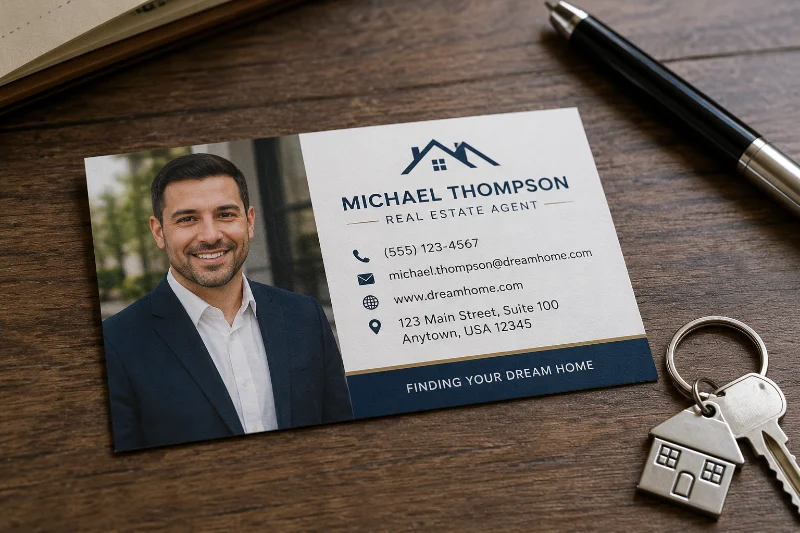
Some agents run a full headshot across half the card, with contact details set in a clean column beside it. This works particularly well for agents building a personal brand separate from a large brokerage, since the face, not a logo, becomes the recognizable asset.
3. Bold Color And Brand-Driven Designs
Brokerages with a distinct visual identity, such as a specific shade of teal or a bold serif logo, often push that identity onto every agent’s card instead of letting each agent pick their own layout. This trades individual personality for brand recognition across a team, which matters more in markets where the brokerage name carries weight.
4. QR Code And Digital-Linked Cards
A small QR code in a corner that links to a listings page, a booking calendar, or a digital contact download has become common on newer card designs. It gives the card a second life after the physical copy gets thrown away, since the scan history and link still connect back to the agent.

Card Stock, Finish, And Print Choices That Matter
Paper weight changes how a card feels in someone’s hand, and that impression happens before anyone reads a single word. Anything under 14pt cardstock tends to feel thin and cheap next to a competing agent’s card at the same closing table. Most print shops recommend 16pt to 32pt stock for real estate cards specifically, since agents hand these out in bulk and need them to survive a wallet or a glove box.
Finish matters almost as much as weight. A matte finish resists fingerprints and glare in photos, while a glossy finish makes colors and headshots look sharper under indoor lighting. Some agents choose a soft-touch laminate, which adds a slightly textured feel that people notice when they pick the card back up.
Rounded corners, spot UV accents on a logo, or a slightly heavier stock than standard business cards are small upgrades that cost little extra per card but change how the card compares against a stack of plain ones.
Ordering in smaller batches of 100 to 250 cards, instead of the standard 500 or 1,000 print run, gives an agent room to fix a typo, update a phone number, or swap a photo without wasting hundreds of unused cards. Prices per card at that smaller quantity run higher, but the flexibility tends to matter more for agents still adjusting their branding in the first year or two.
Printed Cards Versus Digital Business Cards
Digital business cards, shared as a link or an NFC tap, have picked up some traction among newer agents, and they solve a real problem: contact details never go out of date once the phone number or brokerage changes. That advantage is real, but a digital-only card also disappears the moment nobody is holding a phone up to tap or scan, which is exactly the moment at an open house or a curbside conversation when a physical card still does the job.
Most agents who have tried dropping printed cards entirely end up bringing a small stack back within a season or two, usually after a client mentions they lost the digital link in a text thread they can no longer find. The two formats work better together than as a replacement for one another. A printed card with a small QR code, covered above, effectively is that combination, since it hands over something physical while still linking to a page that can be updated anytime.
Where To Design Or Order Real Estate Business Cards
Agents generally land in one of three places when it is time to actually produce the cards. A template-based tool like Canva lets an agent drag in a headshot, adjust colors to match their brokerage, and order printing directly without hiring a designer. This works well for a first set of cards or for an agent testing a new layout before committing to a larger print run.
For a more custom result, freelance marketplaces such as 99designs or DesignCrowd let multiple designers submit competing concepts for a single project, and the agent picks the one that fits. This costs more than a template but produces a layout that is harder to mistake for another agent’s card.
Pinterest remains one of the most common places agents go before starting either route, since it surfaces real printed examples and layout ideas by search term instead of generic template previews. Searching there for specific styles, such as photo-forward or minimalist, narrows down a direction before opening a design tool.
Common Mistakes To Avoid
A surprising number of printed cards go out with a phone number that has changed, a brokerage name that merged, or a headshot that is several years and one hairstyle out of date. Any of these forces the person holding the card to double-check details somewhere else, which defeats the point of handing over a physical card in the first place.
Overcrowding the card with every possible credential, award, and social media handle is another common problem. A card with six different icons and three phone numbers reads as cluttered instead of credible, and the one detail someone actually needs gets buried among the rest.
Cards printed at the cheapest available stock and finish tend to look and feel worse than the price difference actually justifies, since the jump from thin stock to a mid-weight matte card is often only a few cents per unit at bulk print quantities.
Font choice causes its own set of problems that only show up after the cards are already printed. A thin, decorative script might look elegant on a screen at full size, but shrunk down to a two by three and a half inch card, the same font can become unreadable under dim lighting at an evening open house. Sticking to a clean sans serif or a simple serif for the name and phone number, and saving any decorative font for a small tagline, avoids that problem entirely.
A card that gets the basics right, current contact details, a recognizable photo, readable type, and stock that does not feel flimsy, will outperform a more elaborate design that gets any of those fundamentals wrong.